

Notice
Recent Posts
Recent Comments
Link
| 일 | 월 | 화 | 수 | 목 | 금 | 토 |
|---|---|---|---|---|---|---|
| 1 | 2 | 3 | 4 | 5 | 6 | |
| 7 | 8 | 9 | 10 | 11 | 12 | 13 |
| 14 | 15 | 16 | 17 | 18 | 19 | 20 |
| 21 | 22 | 23 | 24 | 25 | 26 | 27 |
| 28 | 29 | 30 |
Tags
- break문
- Java
- function
- 포함관계
- OPP개념
- 연관관계
- multi-threading
- 인텔리제이 기초 설정
- for문
- 메서드
- 시스템 환경 변수 편집
- 반복문
- JAVA객체지향
- JAVA기초
- 메서드 오버로딩
- 집합관계
- 형 변환
- continue문
- 생성자
- java변수
- Java데이터 타입
- Thread
- this예약어
- 상수
- While
- 자바 멀티스레딩
- IntelliJ IDEA
- 접근제어지시자
- 컴파일
- 인텔리제이 한글 깨짐 해결법
Archives
- Today
- Total
최원종의 개발 블로그
CSS flexbox 사용해보기 - 14 본문
1. Flexbox 속성으로 반응형 레이아웃(어떻게 배치하고 정렬) 준비하기
(1) flex-wrap: 요소를 줄 바꿈 하기
flex-wrap은 Flex Item이 한 줄에 모두 배치될지, 아니면 여러 줄로 나뉠지를 결정합니다.
반응형 디자인에서 화면이 작아질 때 요소가 자동으로 줄바꿈되도록 설정하는 데 유용합니다.

- nowrap: 한 줄에 모두 배치 (기본값).
- wrap: 공간이 부족하면 줄바꿈.
- wrap-reverse: 줄바꿈하되, 줄 순서가 반대.
예제 코드 1 flex-wrap으로 반응형 줄바꿈
<!doctype html>
<html lang="en">
  <head>
    <meta charset="UTF-8" />
    <meta name="viewport" content="width=device-width, initial-scale=1.0" />
    <title>Document</title>
    <style>
      .container {
        display: flex;
        flex-wrap: nowrap;

        border: 2px solid greenyellow;
        padding: 10px;
      }
      .item {
        width: 100px;
        height: 100px;
        background-color: tomato;
        margin: 5px;
        border: 2px solid black;
        border-radius: 10px;
        line-height: 100px;
        text-align: center;
        color: white;
      }
    </style>
  </head>
  <body>
    <div class="container">
      <div class="item">1</div>
      <div class="item">2</div>
      <div class="item">3</div>
      <div class="item">4</div>
      <div class="item">5</div>
    </div>
  </body>
</html>
(2) flex-flow: flex-direction과 flex-wrap 단축 속성
flex-flow는 flex-direction과 flex-wrap을 한 번에 설정하는 단축 속성입니다.

- **형식**: flex-flow: [flex-direction] [flex-wrap];
예제 코드 2 flex-flow 사용
<!doctype html>
<html lang="en">
  <head>
    <meta charset="UTF-8" />
    <meta name="viewport" content="width=device-width, initial-scale=1.0" />
    <title>Document</title>
    <style>
      .container {
        height: 700px;
        display: flex;
        /* -------------------- */
        flex-wrap: nowrap;
        flex-direction: column;
        /* 단축해서 지정할 수 있음 */
        flex-flow: row wrap;
        /* 가로에 줄바꿈 처리 속성 */

        /* 자식 요소 정렬해보기
        위에서 아래로 실행되기때문에 마지막 코드 실행됨*/
        justify-content: center;
        justify-content: start;
        justify-content: end;
        justify-content: space-around;
        justify-content: space-between;
        justify-content: space-evenly;
        /* 교차축 방향 정렬 */
        align-items: center;
        align-items: start;
        align-items: end;

        border: 2px solid greenyellow;
        padding: 10px;
      }
      .item {
        width: 100px;
        height: 100px;
        background-color: aquamarine;
        margin: 5px;
        border: 2px solid black;
        border-radius: 10px;
        line-height: 100px;
        text-align: center;
        color: black;
      }
    </style>
  </head>
  <body>
    <div class="container">
      <div class="item">1</div>
      <div class="item">2</div>
      <div class="item">3</div>
      <div class="item">4</div>
      <div class="item">5</div>
    </div>
  </body>
</html>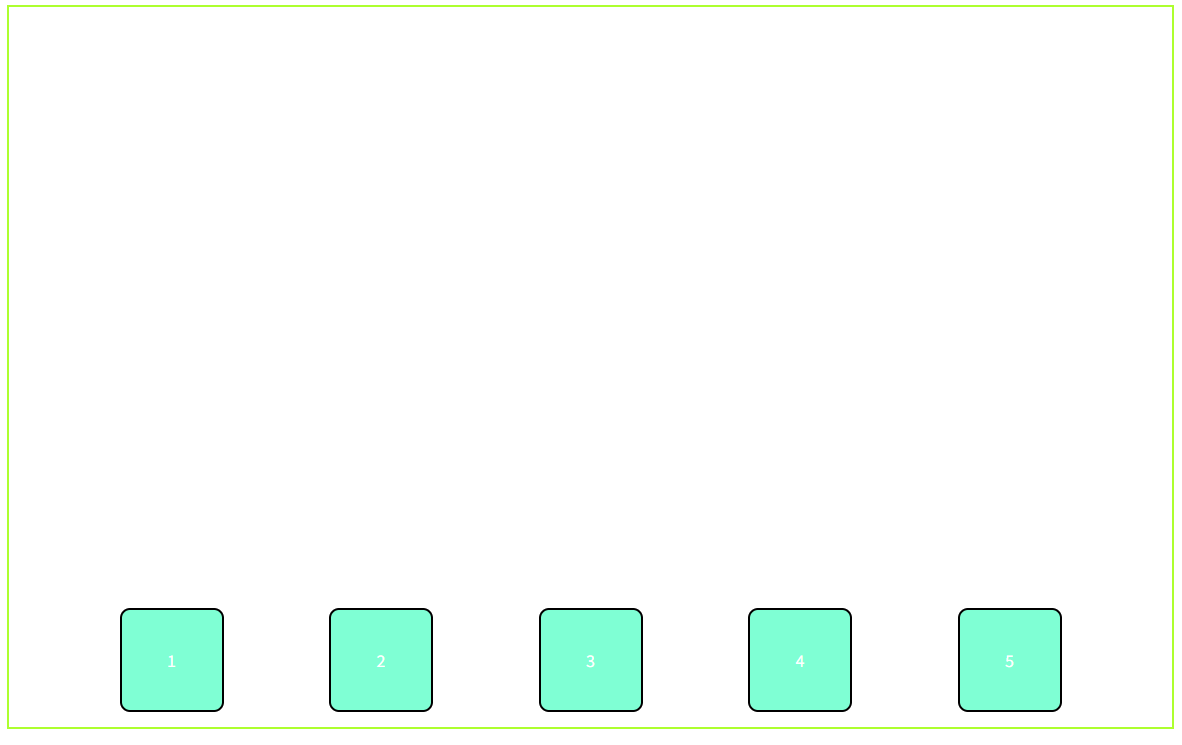
2. Flex Item의 크기 조정을 위한 속성
반응형 디자인에서는 화면 크기에 따라 요소의 크기가 적절히 변해야 하므로, 이 속성들이 매우 유용함
(1) flex-grow: 남는 공간을 채우기
flex-grow는 Flex Container의 남는 공간을 Flex Item이 얼마나 차지할지를 결정함

- **값**:
    - 기본값: `0` (남는 공간을 차지하지 않음).
    - 숫자: 값이 클수록 더 많은 공간을 차지.
예제 코드 3 flex-grow로 남는 공간 분배
<!doctype html>
<html lang="en">
  <head>
    <meta charset="UTF-8" />
    <meta name="viewport" content="width=device-width, initial-scale=1.0" />
    <title>Document</title>
    <style>
      .container {
        display: flex;
        border: 2px solid yellowgreen;
        padding: 20px;
      }
      .item {
        width: 100px;
        height: 100px;
        background-color: yellow;
        margin: 10px;
        border: 2px solid black;
        border-radius: 10px;
        text-align: center;
        line-height: 100px;
      }
      .item1 {
        flex-grow: 1;
      }
      .item2 {
        flex-grow: 1;
      }
      .item3 {
        flex-grow: 1;
      }
      .item4 {
        flex-grow: 2;
      }
      .item5 {
        flex-grow: 5;
      }
    </style>
  </head>
  <body>
    <div class="container">
      <div class="item item1">1</div>
      <div class="item item2">1</div>
      <div class="item item3">1</div>
      <div class="item item4">2</div>
      <div class="item item5">5</div>
    </div>
  </body>
</html>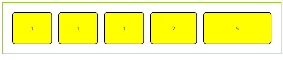
(2) flex-shrink: 공간이 부족할 때 축소하기
flex-shrink는 Flex Container의 공간이 부족할 때 Flex Item이 얼마나 축소될지를 결정합니다.

- **비유**: 책상 공간이 부족할 때 물건을 조금씩 줄여서 공간을 맞추는 것과 같아요.
- **값**:
    - 기본값: 1 (축소 가능).
    - 숫자: 값이 클수록 더 많이 축소.
예제 코드 4: flex-shrink로 축소 조정
<!doctype html>
<html lang="en">
  <head>
    <meta charset="UTF-8" />
    <meta name="viewport" content="width=device-width, initial-scale=1.0" />
    <title>Document</title>
    <style>
      .container {
        display: flex;
        border: 2px solid yellowgreen;
        padding: 20px;
      }
      .item {
        width: 200px;
        height: 100px;
        background-color: yellow;
        margin: 10px;
        border: 2px solid black;
        border-radius: 10px;
        text-align: center;
        line-height: 100px;
      }
      .item1 {
        flex-shrink: 0;
      }
      .item2 {
        flex-shrink: 1;
      }
      .item3 {
        flex-shrink: 0;
      }
      .item4 {
        flex-shrink: 2;
      }
      .item5 {
        flex-shrink: 0;
      }
    </style>
  </head>
  <body>
    <div class="container">
      <div class="item item1">1</div>
      <div class="item item2">1</div>
      <div class="item item3">1</div>
      <div class="item item4">2</div>
      <div class="item item5">1</div>
    </div>
  </body>
</html>

(3) flex-basis: 기본 크기 설정
flex-basis는 Flex Item의 기본 크기를 설정합니다. 주축 방향에 따라 width 또는 height를 대체합니다.

- **비유**: 책상 위 물건의 기본 크기를 정하는 것과 같아요. "이 물건은 기본적으로 10cm로 시작하자!" 같은 느낌.
- **값**:
    - auto: 요소의 기본 크기(예: width나 height).
    - 숫자(px, %, 등): 고정 크기.
    - `0`: 최소 크기로 시작.
예제 코드 5: flex-basis 사용
<!doctype html>
<html lang="en">
  <head>
    <meta charset="UTF-8" />
    <meta name="viewport" content="width=device-width, initial-scale=1.0" />
    <title>Document</title>
    <style>
      .container {
        display: flex;
        border: 2px solid greenyellow;
        padding: 20px;
      }
      .item {
        width: 200px;
        height: 100px;
        background-color: yellow;
        margin: 10px;
        border: 2px solid black;
        border-radius: 10px;
        text-align: center;
        line-height: 100px;
      }
      .item1 {
        flex-grow: 0;
        flex-shrink: 0;
        flex-basis: 100px;
      }
      .item2 {
        flex-grow: 0;
        flex-shrink: 1;
        flex-basis: 50px;
      }
    </style>
  </head>
  <body>
    <div class="container">
      <div class="item item1">1</div>
      <div class="item item2">2</div>
    </div>
  </body>
</html>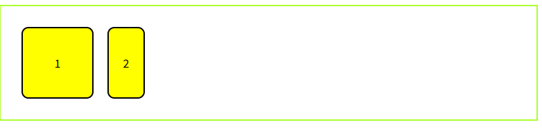
(4) flex 단축 속성: flex-grow, flex-shrink, flex-basis 한 번에 설정
flex는 flex-grow, flex-shrink, flex-basis를 한 번에 설정하는 단축 속성입니다.

- **형식**: flex: [flex-grow] [flex-shrink] [flex-basis];
- **비유**: 물건의 성장, 축소, 기본 크기 규칙을 한 번에 정하는 것과 같아요.
- **자주 사용하는 값**:
    - flex: 1;: flex-grow: 1; flex-shrink: 1; flex-basis: 0;과 같음.
    - flex: auto;: flex-grow: 1; flex-shrink: 1; flex-basis: auto;와 같음.
예제 코드 6
<!doctype html>
<html lang="en">
  <head>
    <meta charset="UTF-8" />
    <meta name="viewport" content="width=device-width, initial-scale=1.0" />
    <title>Document</title>
    <style>
      .container {
        display: flex;
        border: 2px solid greenyellow;
        padding: 20px;
      }

      .item {
        height: 100px;
        background-color: yellow;
        margin: 10px;
        border: 2px solid black;
        border-radius: 10px;
        text-align: center;
        line-height: 100px;
      }

      .item1 {
        /* flex-grow: 0;
        flex-shrink: 1;
        flex-basis: 100px; */
        /* 위 3개의 단축 속성  */
        flex: 0 1 100px;
      }
      .item2 {
        /* flex-grow: 0;
        flex-shrink: 1;
        flex-basis: 50px; */
        flex: 0 1 50px;
      }
    </style>
  </head>
  <body>
    <div class="container">
      <div class="item item1">1</div>
      <div class="item item2">2</div>
    </div>
  </body>
</html>
'HTML_CSS > 사전학습' 카테고리의 다른 글
| CSS flexbox 사용해보기 - 13 (0) | 2026.04.17 |
|---|---|
| CSS position 관련 속성(Position, Z-Index) - 12 (0) | 2026.04.17 |
| CSS 박스 모델에 이해 - 11 (0) | 2026.04.17 |
| CSS 선택자(속성 선택자) - 10 (0) | 2026.04.17 |
| CSS 선택자(가상 클래스 선택자) - 9 (0) | 2026.04.16 |
'HTML_CSS/사전학습' Related Articles
more


